Zoosk Store Redesign
Modernizing the workflow to subscribe to Zoosk while adding new payment types for a global user base
This was my first project when I joined Zoosk out of school. The store is also how Zoosk made its money; my stakeholder was the CEO. So, saying it was a little stressful would be acceptable.
My Role
Interaction Design
Information Architecture
Researcher
Motion Designer
Deliverables & Responsibilities
Payments Diagram
Prototype
Wireframes
Requirements
User Flows
Project Details
Duration: 4 months
Teammates: 3 PM, 3 Engineering teams, 1 Visual Designer
Collaborators: Engineering, Payments PM, Visual Design
Stakeholders: CEO of Zoosk
The Ask
Redesign the store and checkout experience to bring it in line with the rest of the product
The overall design, functionality, look, and feel of the Zoosk purchasing experience no longer aligned with the rest of the site design. This was a jarring experience for people using the product that needed to be updated in addition to integrating some new payment methods.
Process
Understanding Worldwide Payments
Zoosk is present in over 70 countries, so I needed to be familiar with numerous payment types we do not have in the United States. The Product Manager and I had several meetings where we reviewed various payment options, how each functioned, and any time delays involved.
After this initial requirements gathering and clarification phase, a research phase began. Working with the product manager, we looked for exemplars in retail, e-commerce, online wallets, and various other payment systems to determine overall best practices to include in the new store experience.
Foundations
The store often appears because of a paywall, so the store needed to be quick and easy. This would allow people to get back to what they were doing.
Quick & Easy

Through user feedback, it was clear that when it came to making purchases online, people were cautious. There was a pain point around the amount and size of text involved. So clear communication throughout the process was important.
Clear Communication

a third pain point that we uncovered was that some payment types take a period of time to process, which led to disappointment. To tackle this issue I included clear feedback to set expectations as well as provide quicker payment options to choose from.
Timing Expectations

New Store
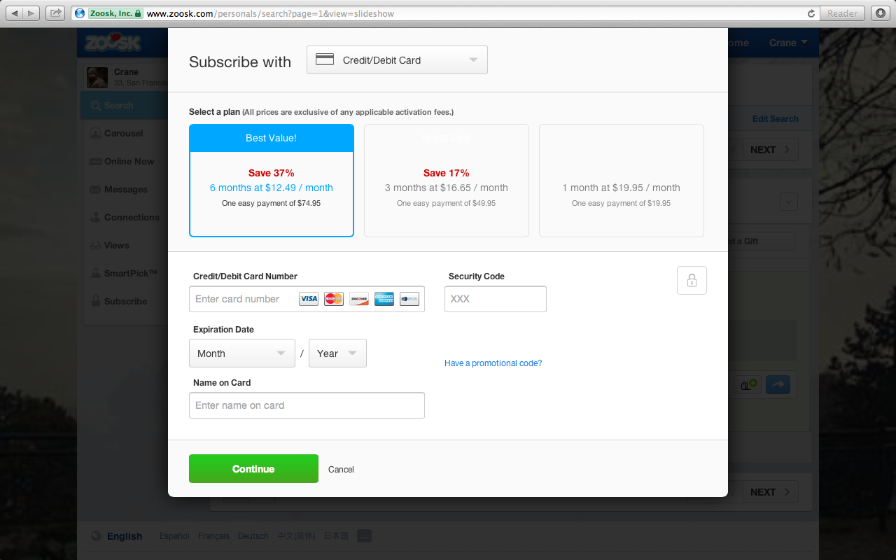
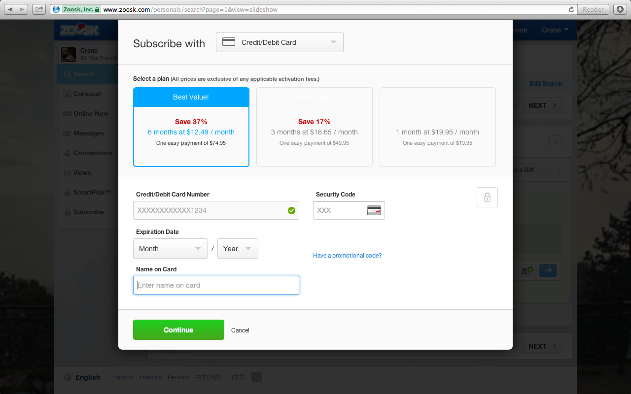
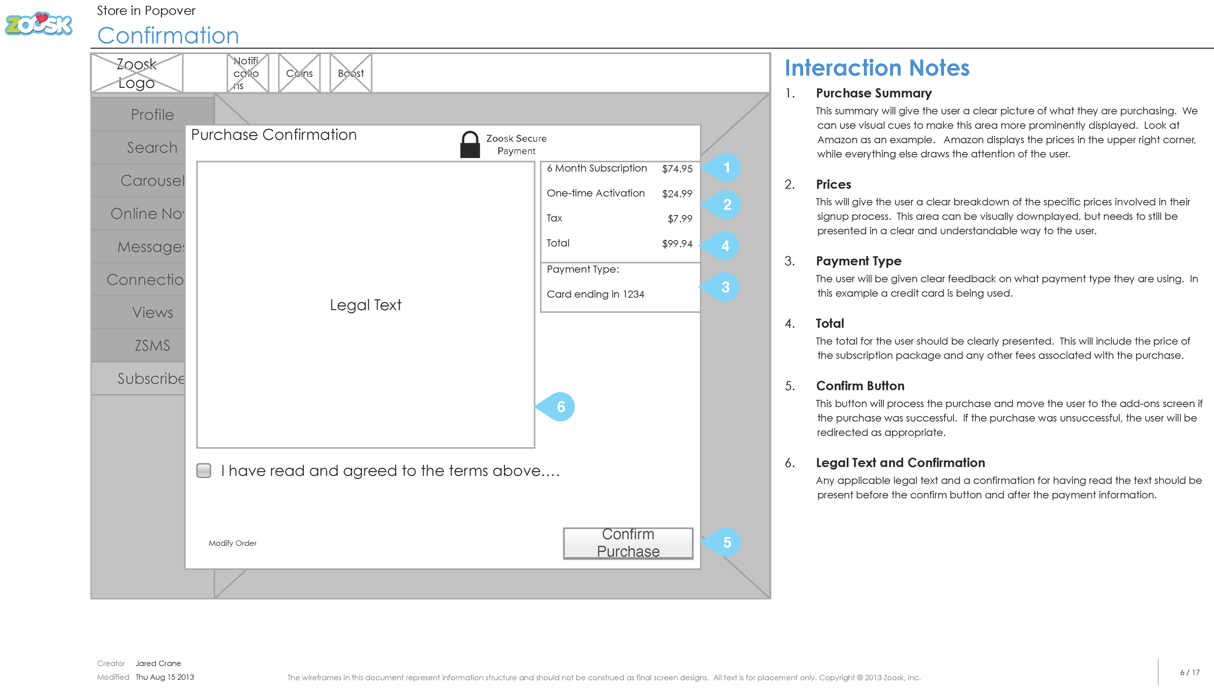
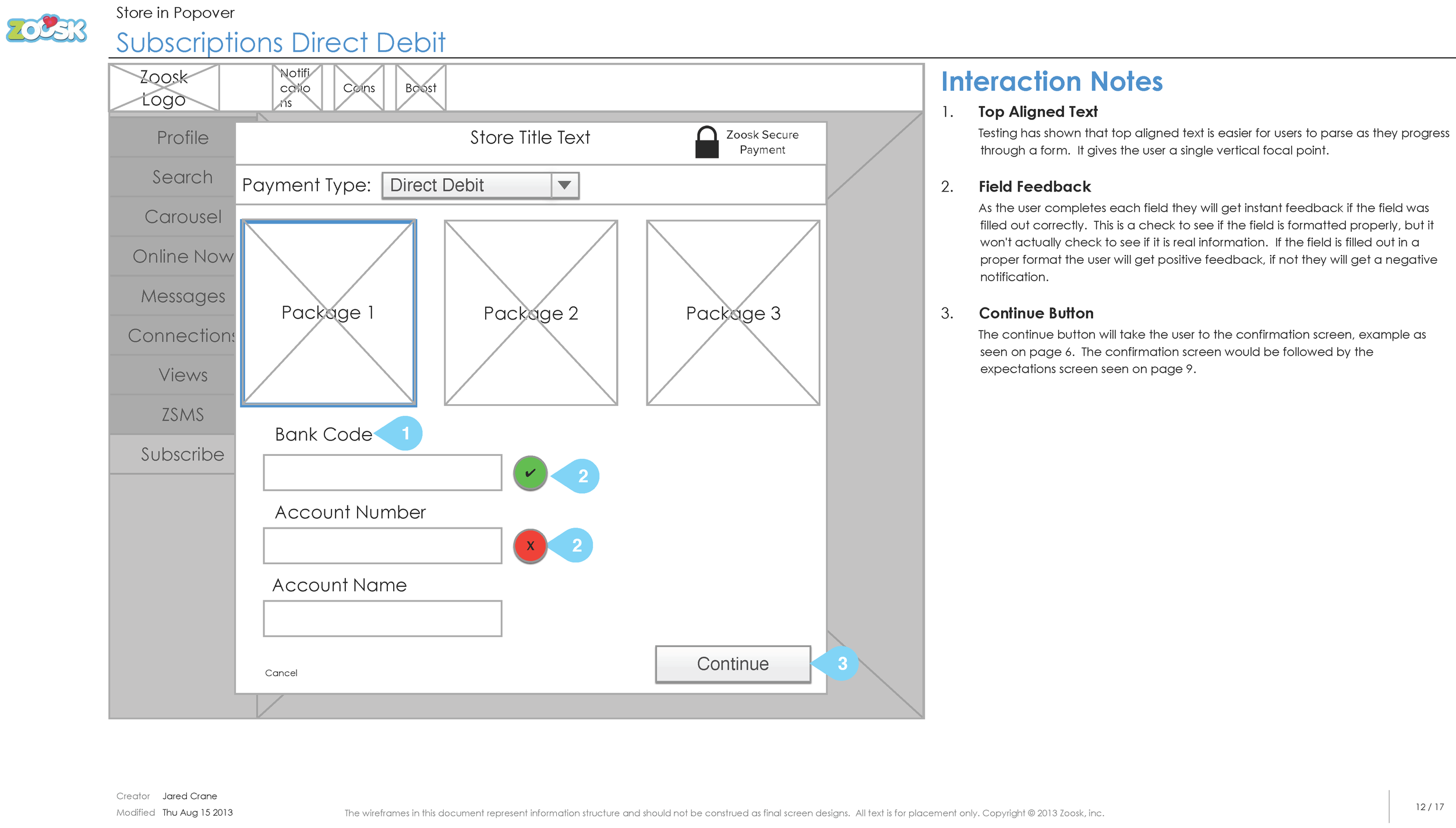
The store process transitioned from a single page to a two-step process for certain payment types, simplifying decision-making and enhancing clarity. I streamlined the primary credit card payment fields to reduce the required information. Micro-interactions, including inline checks and animations for recognized card types, were added for immediate feedback and improved user experience.
Results
15% increase in subscriptions
12% increase in virtual currency


Motion Design Video
I did the animations using After Effects. This was done to help introduce motion design to both stakeholders and the engineering teams. It proved to be an effective tool to help the different engineering teams implement movement into the design.
But wait, there’s more!
Big Visual Redesign
This one wasn’t merely a paint job. I had to take our new design system, be the first to apply it, and help expand it to meet the product needs. Additionally, I was adding responsiveness where it hadn’t existed, introducing animations, revamping workflows, and doing research while ensuring it was accessible.